Key Takeaways:
- Perception beats logic. Consumers often choose less valuable options when judged in isolation due to emotional or visual cues.
- Evaluation mode matters. Preferences shift depending on whether choices are evaluated separately or side by side.
- Simplicity sells. Highlighting one substantial, easy-to-understand benefit works better than listing many features.
- Framing drives value. Pricing, design, and product range should align with how consumers mentally benchmark value.
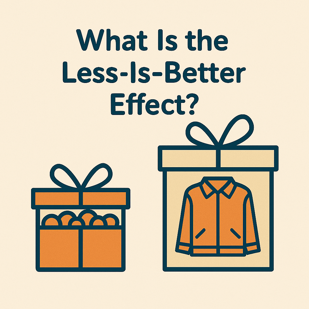
What Is the Less-Is-Better Effect?
The less-is-better effect highlights a quirk in our decision-making: people tend to prefer an objectively inferior option when it’s presented on its own, but they switch their preference to a better option when comparing both side by side. This idea was first put forward by behavioural scientist Christopher Hsee and has been backed by various consumer psychology studies.
In Hsee’s original research, participants showed a greater willingness to pay for a 7-oz ice cream that overflowed from a 5-oz cup rather than an 8-oz serving in a half-empty 10-oz cup. However, when these options were evaluated alongside one another, the larger portion emerged as the more appealing choice. When viewed in isolation, the perception of visual fullness, a qualitative cue, tended to distort their sense of value.
Why Does the Less-Is-Better Effect Happen?
The less-is-better effect isn’t just a curious quirk of irrational decision-making; it highlights how our brains evaluate choices based on context, simplicity, and relative value. When we assess options in isolation, we’re often swayed by superficial or easily judged features, which can surprisingly lead to shifts in our preferences. Below, we’ll delve into the key psychological mechanisms behind this fascinating effect.
The Evaluability Hypothesis: Why “Easy to Judge” Wins
When people evaluate a product on its own, they often focus on features that are easy to see and understand, even if those features aren’t necessarily the most important ones. This is referred to as the evaluability hypothesis.
Take ice cream, for instance. The fullness of a cup is something we can easily see, while the total ounces might take a bit more thought. In a well-known experiment, individuals were willing to pay more for a 7-oz serving that was piled high in a 5-oz cup than for an 8-oz serving that was only halfway full in a 10-oz cup. However, when presented with both options side by side, people tended to make the more logical choice and opt for the larger portion.
Norm Theory: The Power of Category Expectations
People often assess products not just based on their absolute worth but rather in relation to what they consider “normal” for that particular category. This concept is referred to as norm theory.
Take gift-giving, for example: a £45 scarf seems generous because scarves generally tend to be cheaper. However, a £55 coat might come across as a bit underwhelming, as we usually expect coats to be pricier, even though it is, in fact, more expensive. This kind of mental benchmarking helps to explain why a so-called “inferior” option can sometimes seem better when viewed in isolation.
How the Less-Is-Better Effect Influences Consumer Behaviour
When does the less-is-more effect come into play? The key lies in how options are presented to consumers, either in isolation or side by side. This subtle distinction in how we evaluate our choices plays a significant role in decision quality, perceived value, and, ultimately, our buying habits.
Shoppers often don’t assess everything rationally or consistently. The context of their decision-making, what they can see, what they can compare, and what resonates emotionally, has a greater impact on their final choice than we might think. Here’s how this plays out in real-world consumer actions:
When Choices Are Evaluated Separately
- Shoppers often look for quick and easy cues, such as how complete or full something appears, or its overall simplicity.
- Their choices are usually driven more by emotion than by cold, hard facts.
- This is particularly true when choosing gifts, in single-product advertisements, or during moments of impulse buying.
Behavioural Outcome: People often place too much importance on qualitative qualities, like a cup that’s filled to the brim or a product that looks pristine, resulting in choices that may not be the best, but feel good emotionally.
When Choices Are Evaluated Together
- Shoppers often take the time to compare measurable attributes like size, price, and quantity before making a decision.
- This thoughtful approach typically leads them to choose options that maximise value.
- Such comparisons are frequently found in e-commerce listings, price tables, or feature comparisons.
Behavioural Outcome: People are starting to prefer better options based on facts, and the charm of appearance is losing its sway.
| How Evaluation Context Influences the Less-Is-Better Effect | |||
|---|---|---|---|
| Evaluation Mode | Shopper Behavior | Outcome | Common Contexts |
| Separate Evaluation | Relies on quick, emotional cues like visual completeness or simplicity | Overvalues qualitative traits (e.g., fullness, neatness) | Gift buying, impulse purchases, and product ads |
| Joint Evaluation | Compares measurable attributes like size, price, or quantity | Chooses options based on objective value and rational comparison | E-commerce listings, pricing tables, comparisons |
Real-World Examples
- Gift Giving: Interestingly, a £45 scarf tends to come across as more generous than a £55 coat, at least when each item is considered on its own.
- Dinnerware Study: In a recent study, participants leaned towards a 24-piece set that was complete, rather than a 40-piece set that had a few broken items. This was true even though the latter offered more usable pieces overall.
- Recruitment: In one particular study, a candidate boasting a higher GPA was often preferred over one with more hands-on experience, until the two were directly compared with one another.
Marketing Applications of the Less-Is-Better Effect
1. Product Design: Emphasise Quality over Quantity
When consumers assess a product on its own, they tend to judge its value based on qualities that are easy to perceive, such as visual appeal or impeccable execution, rather than the overall features or specifications. This suggests that a simpler product, which appears more “perfect,” may be viewed as superior to a more comprehensive option that has noticeable flaws.
Strategy in action:
- Position minimal, well-finished products as premium.
- Avoid overloading feature sets if some elements aren’t polished or relevant.
- Highlight “complete” or “uncompromised” benefits in single-product messaging.
Tactical examples:
- Showcase “perfectly curated” product bundles.
- Reduce visual clutter in packaging and UI.
- Emphasise flawlessness (“100% intact,” “no fillers,” “no compromise”).
Sometimes, people don’t just value what’s perfect—they value what they built themselves.
👉 Explore how the IKEA Effect helps explain why effort can increase perceived value.
2. Pricing Strategy: Frame Value Through Category Norms
The less-is-better effect suggests that consumers judge value in relation to others rather than in absolute terms. This insight gives marketers a chance to shape how generous or valuable their offerings appear by aligning expectations with what’s typical in their category.
Strategy in action:
- Frame prices relative to expectations within the product category.
- Use visual or textual cues to elevate perceived value without lowering price.
- Avoid direct feature-to-price comparisons when the offer’s strengths are qualitative.
Tactical examples:
- A £45 scarf feels luxurious if scarves are usually £25.
- “Most complete solution under £50” reinforces category leadership.
- Use anchor pricing sparingly to avoid encouraging joint comparison.
Curious how smart pricing can subtly influence customer decisions?
👉 Discover the psychology behind the Decoy Effect and learn how to guide buyers to your preferred option.
3. Promotional Messaging: Simplify and Amplify One Strong Benefit
Promotions are often seen in isolation, whether it’s ads, emails, or banners, so it’s best to concentrate on one clear benefit that’s easy to understand. Avoid watering down your message with too many claims, particularly if some of those attributes are tricky to verify or explain.
Strategy in action:
- Craft single-message campaigns that highlight one dominant, sensory or emotional benefit.
- Remove less relevant features from messaging to avoid cognitive overload.
- Reinforce completeness or exclusivity, rather than versatility.
Tactical examples:
- “Overflowing value in every box” (not “Includes 23 features”).
- Use emotionally salient phrases like “flawless,” “generous,” and “complete.”
- Avoid side-by-side comparisons unless needed; let the product shine alone.
4. Product Line Architecture: Simplify the Range to Strengthen Preference
When customers are presented with an overwhelming number of choices, the differences between products can become unclear, leading to a decrease in satisfaction when making a decision. Simplifying or streamlining the product range can enhance conversion rates, as it allows the standout options to shine and be more easily evaluated.
Strategy in action:
- Reduce SKUs or product variants where options are too similar or confuse value perception.
- Curate “best fit” or “recommended” options to guide decisions.
- Avoid introducing variants that are weaker in salient traits (e.g., packaging, completeness).
Tactical examples:
- Follow Costco’s or Zara’s model: fewer SKUs, faster decisions.
- Offer “default” versions as the safe and trusted choice.
- Categorise offerings by context of use rather than technical specs (e.g., “on-the-go kit” vs. “3-feature model”).
5. Visual Branding: Leverage Minimalism and Perceived Clarity
When you combine minimalist design with clear value messaging, you emphasise the idea that less is more. This simplicity not only grabs attention but also builds a sense of trust and sophistication.
Strategy in action:
- Use whitespace and simplified layouts to isolate key benefits.
- Limit visual noise, one idea per visual block or frame.
- Reinforce trust through visual precision and intentional design gaps.
Tactical examples:
- Apple and Google use centred, uncluttered layouts with strong focal points.
- Taglines like “Nothing more. Nothing less.” underline value through minimalism.
- Use scarcity-inspired visuals (e.g., single product image, zero distractions) to frame exclusivity.
| How to Use the Less-Is-Better Effect in Marketing Strategy | |||
|---|---|---|---|
| Marketing Tactic | Description | Strategic Focus | Tactical Applications |
| Product Design | Simpler, polished products often outperform feature-heavy but imperfect alternatives. | Highlight perceived perfection and completeness. | “Perfectly curated” bundles, reduced visual clutter, emphasis on “no compromise.” |
| Pricing Strategy | Consumers judge price based on category norms, not absolute value. | Frame pricing relative to expectations, not feature count. | “Most complete under £50,” avoid direct spec-to-price comparisons, use anchor pricing selectively. |
| Promotional Messaging | One strong, salient message is more persuasive than many weak ones. | Focus on a dominant emotional or sensory benefit in isolated messaging. | “Overflowing value,” use emotional terms like “generous,” avoid comparison tables unless necessary. |
| Product Line Architecture | Too many choices can reduce clarity and satisfaction. | Streamline offerings, highlight default or best-fit options. | Reduce SKUs, use context-based categories, promote “recommended” products. |
| Visual Branding | Minimalist, clear layouts increase trust and value perception. | Use whitespace and clarity to focus attention and signal confidence. | Apple-style visual hierarchy, scarcity-driven product images, strong single-message layouts. |
Best Practices for Marketers
- Simplify your product lines, but maintain category relevance.
- Emphasise easily evaluable strengths in single-product ads.
- Avoid overpromising simplicity, be specific (“easy setup” > “simple”).
- Use strategic scarcity to elevate perceived value.
- Audit branding for clutter, minimise where it builds trust.
Less-Is-Better vs. The Paradox of Choice
While both advocate for less, the mechanisms differ:
| Less-Is-Better vs. The Paradox of Choice | ||
|---|---|---|
| Aspect | Less-Is-Better Effect | Paradox of Choice |
| Core Issue | Preference reversal from isolated judgment | Overwhelm from excessive options |
| Evaluation Mode | Separate vs. joint evaluation | Implicit comparison across many choices |
| Psychological Trigger | Attribute salience, norm comparison | Decision fatigue, FOMO |
| Result | Suboptimal choice in isolation | Decision paralysis, regret |
Embrace the less-is-more approach to enhance how choices are perceived. By understanding the paradox of choice, we can streamline extensive selections through thoughtful choice architecture.
Want to dive deeper into how too many choices can hurt decision quality?
👉 Read our full breakdown of the Paradox of Choice and learn how to simplify your offers effectively.
Conclusion
The less-is-better effect highlights a vital truth: perception often trumps logic when it comes to consumer choices. For marketers, it offers a strategic edge. By understanding how context, simplicity, and the evaluation of options influence preferences, you can craft product experiences, pricing strategies, and messaging that feel more valuable, even if they provide less.
FAQ
The less-is-better effect is a cognitive bias that leads people to sometimes choose an option that is objectively worse when they assess it on its own. This is particularly true if that option seems more complete or easier to evaluate. However, when people compare options side by side, their preferences often change.
Consumers often depend on quick, intuitive signals, such as visual appeal or perceived completeness, when making decisions independently. This can result in them opting for products that feel more appealing, even if they provide less genuine value.
– Emphasise one strong, clear benefit in your messaging
– Use a minimalist design and reduce cognitive overload
– Frame pricing and product offerings relative to category norms
– Limit options when appropriate to avoid decision fatigue
